

 The redesign of Chicago magazine in print and online marks the first complete makeover of the publication since 2007. And it's a beauty.
From its bold new logo and new tag line ("Big City, Big Stories") to its sharp new typography, layout and organization, the monthly magazine and chicagomag.com have been reconfigured and reimagined from top to bottom with the November issue.
Now fully integrated with its namesake publication, the streamlined and engaging website operates as efficiently on a mobile device as it does on a desktop. (There's still a glitch or two to be fixed. The link to Carol Felsenthal's articles about politics take you to a menu of unrelated posts.) Stand-alone blogs, such as "The 312" and "Style Sheet," have been eliminated in favor of stories organized by subject area. New video and photo features also are being added.
Like Beth Fenner, the Time Inc. veteran who took over as editor-in-chief two years ago, everything about Chicago's new look is smart, stylish and savvy. But compelling content is still her passion. "Chicago is the only magazine in town creating excellent in-depth narratives on subjects that matter deeply to those of us who love the city," Fenner said.
Centerpiece of the new issue is a revealing examination of Michael Ferro, controversial chairman of Wrapports LLC, owner of Sun-Times Media. Senior writer Bryan Smith's 6,800-word profile quotes Ferro saying he should have fired the Sun-Times photography staff sooner than he did last June: “I knew the photographers would be going from the day we took this paper over. We took a year and a half too long to do it. . . . I can tell you 100 percent before we bought this we had that cutlass ready.”
Writes Smith: "As Ferro burns through investors’ money and alienates many of his own employees, some wonder if he is really cooking up a viable digital model to ensure the survival of the Sun-Times or whether he’s just another ego-driven entrepreneur who cares more about hanging with celebrities than about quality journalism."

Beth Fenner
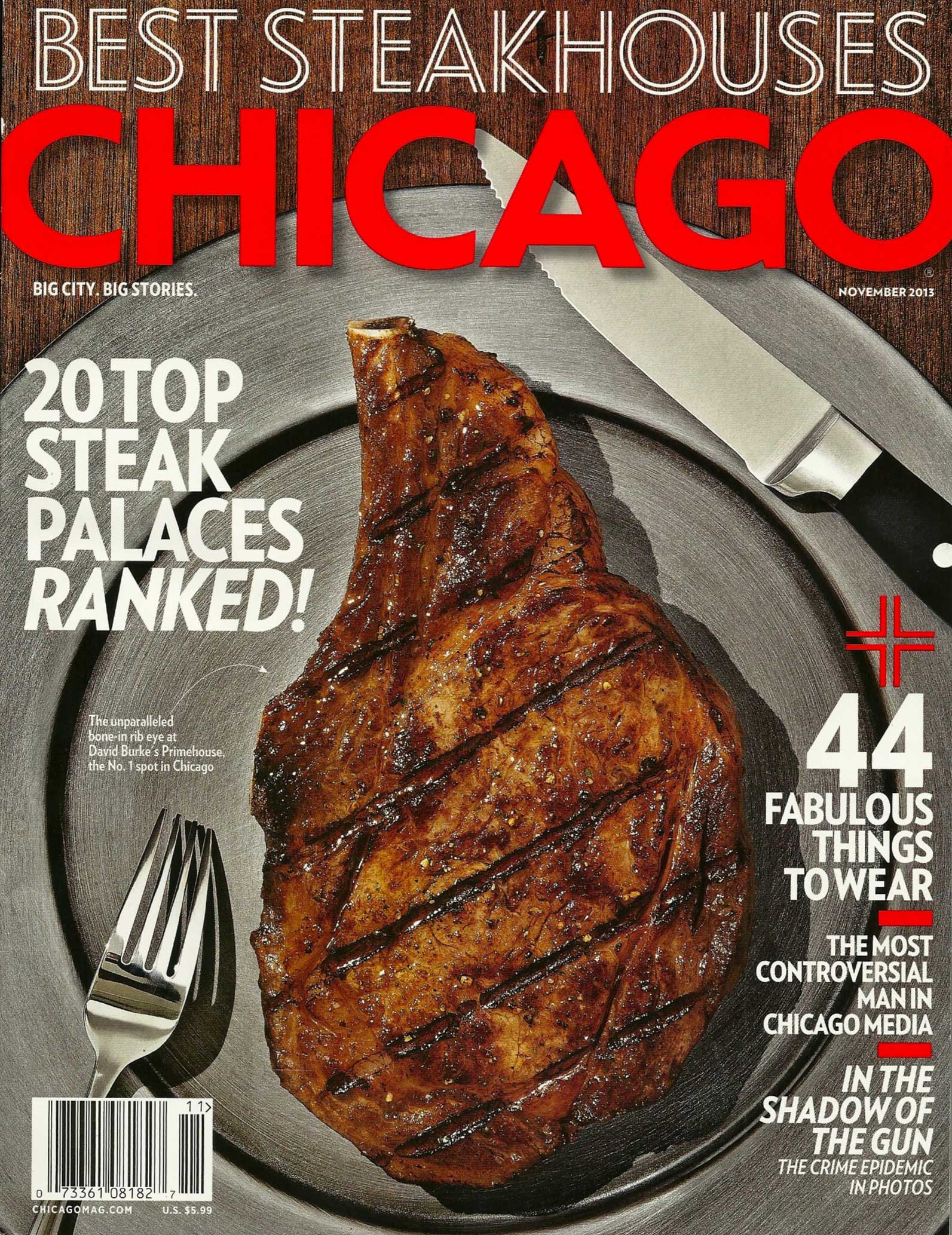
Notably missing from Chicago's November edition after 43 years are the listings of recommended restaurants and cultural events that used to take up page after page in the magazine. Now they're offered online. But food lovers won't go hungry. In addition to an expanded dining section up front, the cover story on Near North Side steak houses is a 12-page feast.
The full listings are also running in the tablet edition of Chicago magazine. "This is a deliberate strategy on our part," Fenner explains. "I feel strongly that digital is our future. By offering more in our digital edition than we do in the print one, we are providing an incentive for readers to migrate to reading us on their tablet devices."
Design director Bryan Erickson oversaw the remake.
"Despite the changes, one thing remains the same as when the bylines of Studs Terkel and Nelson Algren appeared in these pages: our belief that Chicago is the greatest American city," Fenner tells readers in an editor's note. "Flawed, yes, but never boring; full of beauty, innovation, and fascinating characters."
Launched in 1970 by WFMT as an outgrowth of its program guide, Chicago magazine is published by Chicago Tribune Media Group, which also licenses and markets this blog.