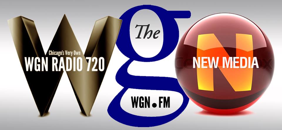
 Introducing new logos for WGN — encompassing radio, online and new media.
The man who designed them says they never were intended to be viewed as a single unit.
Responding to intense criticism from readers, Mike Waterkotte, creative director of Waterkotte Inc., shared the following explanation:
"FYI, What your [sic] looking at is a presentation comp. Done on my iPad mini. It is being used to show how WGN will unfold over the years. The big W is the WGN AM Logo and is now in the finished art, vectoring stage at one of Chicago's top Graphic Design Shops. I agree that row of letters would be awful if were a logo. But it's not."
What do you think?

